The blue butterfly is the symbol of Interflex. If you keep your eyes open, you will notice it in the future in a different form on products, advertising materials or on the new website. Since the Stuttgart-based specialist for modern access control, visitor management, time management and personnel scheduling has refreshed its brand identity: The corporate design, including its logo, has been redesigned, the “Interflex upgrades your work” brand promise has been redefined and a new website has been launched. Interflex strives to present itself more dynamically thanks to this modern visual identity.
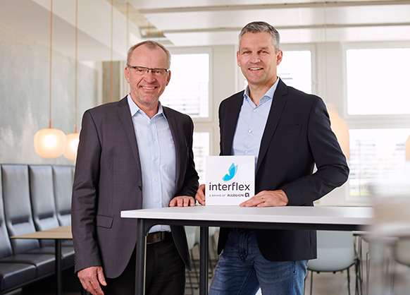
“Interflex is a pioneer of New Work and will remain so. This should be reflected in our new brand identity,” says Bernhard Sommer, Managing Director of Interflex. This also applies to the innovative business models, to which the new identity matches perfectly. “We and the industry are constantly changing, which can be seen in our solutions. In this manner, we are consistently following our ‘cloud first’ strategy and offer an economical and secure cloud-based ecosystem with Interflex Managed Services. This allows companies to streamline processes, reduce costs and increase their productivity. With our products we have also been keeping pace with the times. For instance, our Employee-Self-service solutions can be regarded as a response to the trend towards employees having more independence and taking more personal responsibility. The bottom line is that we strive to make people’s work as easy as possible,” emphasizes Bernhard Sommer.
Showing our roots again
Thanks to new colors and clear design language, the new website ensures that the overall concept is presented in a modern and consistent manner. The logo has been reduced to its essential components and is thus clearer now. The butterfly is still part of our logo as a figurative mark. “Our butterfly symbolizes lightness and freedom in work life, while also indicating dynamic and a new dawn at the same time. At Interflex, this is what we have stood for since the company was founded in 1974. The new website illustrates what is deeply ingrained and actively lived at Interflex,” says Frank Zimmermann, head of Product Management and Marketing at Interflex.
Brand experience on our website
As part of our new brand identity, Interflex launched its new website in Germany. “We want to offer our customers, prospective customers and potential new employees an authentic and attractive brand experience – across all touchpoints,” Zimmermann explains. “Of course, our website plays a key role in this. The new website pulls together all relevant information, is being rolled out in six country versions on the basis of the new international domain www.interflex.com and is tailored to national requirements. The contents are clearly structured and presented. Visual elements complete the overall presentation and make a visit to our website a fascinating experience.”
Interflex has also redesigned the careers section on its website. As part of a new employer branding campaign, employee portraits are being provided, describing what makes Interflex special as an employer for them. In this way, Interflex aims to use its “Freedom for Doers” campaign motto to specifically address and win over new upcoming talent, skilled workers and managers.