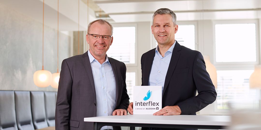
Light and dynamic: Interflex has a new brand identity
Interflex is freshening up its brand presence. The Stuttgart-based company has redesigned its corporate design including logo, redefined its brand promise and launched a new website. With this modern appearance, Interflex presents itself in a more modern and dynamic way.

The blue butterfly is the symbol of Interflex. If you keep your eyes open, you will notice it in the future in a different form on products, advertising materials or on the new website. Since the Stuttgart-based specialist for modern access control, visitor management, time management and personnel scheduling has refreshed its brand identity: The corporate design, including its logo, has been redesigned, the “Interflex upgrades your work” brand promise has been redefined and a new website has been launched. Interflex strives to present itself more dynamically thanks to this modern visual identity.